" width="53.99999830593382px"><path d="M 10.385 5.192 C 10.385 8.06 8.06 10.385 5.192 10.385 C 2.325 10.385 0 8.06 0 5.192 C 0 2.325 2.325 0 5.192 0 C 8.06 0 10.385 2.325 10.385 5.192 Z" fill="rgb(255, 255, 255)" height="10.38462660183226px" id="LsSQhWQdD" width="10.38462660183226px"/><path d="M 0 5.192 C 0 8.06 2.325 10.385 5.192 10.385 C 8.06 10.385 10.385 8.06 10.385 5.192 C 10.385 2.325 8.06 0 5.192 0 C 2.325 0 0 2.325 0 5.192 Z" fill="rgb(255, 255, 255)" height="10.38462660183226px" id="NJzFssgn6" transform="translate(43.615 0)" width="10.38462660183226px"/><path d="M 10.385 5.192 C 10.385 8.06 8.06 10.385 5.192 10.385 C 2.325 10.385 0 8.06 0 5.192 C 0 2.325 2.325 0 5.192 0 C 8.06 0 10.385 2.325 10.385 5.192 Z" fill="rgb(255, 255, 255)" height="10.38462660183226px" id="U4v4ax2zU" transform="translate(7.269 7.269)" width="10.38462660183226px"/><path d="M 0 5.192 C 0 8.06 2.325 10.385 5.192 10.385 C 8.06 10.385 10.385 8.06 10.385 5.192 C 10.385 2.325 8.06 0 5.192 0 C 2.325 0 0 2.325 0 5.192 Z" fill="rgb(255, 255, 255)" height="10.38462660183226px" id="wB3dbS6la" transform="translate(36.346 7.269)" width="10.384525562440537px"/><path d="M 10.385 5.192 C 10.385 8.06 8.06 10.385 5.192 10.385 C 2.325 10.385 0 8.06 0 5.192 C 0 2.325 2.325 0 5.192 0 C 8.06 0 10.385 2.325 10.385 5.192 Z" fill="rgb(255, 255, 255)" height="10.384626601832252px" id="Pmk9dCTbR" transform="translate(14.538 14.538)" width="10.384626601832252px"/><path d="M 0 5.192 C 0 8.06 2.325 10.385 5.192 10.385 C 8.06 10.385 10.385 8.06 10.385 5.192 C 10.385 2.325 8.06 0 5.192 0 C 2.325 0 0 2.325 0 5.192 Z" fill="rgb(255, 255, 255)" height="10.384626601832252px" id="KGppr2PyT" transform="translate(29.077 14.538)" width="10.384626601832252px"/><path d="M 10.385 5.192 C 10.385 8.06 8.06 10.385 5.192 10.385 C 2.325 10.385 0 8.06 0 5.192 C 0 2.325 2.325 0 5.192 0 C 8.06 0 10.385 2.325 10.385 5.192 Z" fill="rgb(255, 255, 255)" height="10.384626601832267px" id="zCKkvcOV6" transform="translate(21.808 21.808)" width="10.384626601832267px"/><path d="M 10.385 5.192 C 10.385 8.06 8.06 10.385 5.192 10.385 C 2.325 10.385 0 8.06 0 5.192 C 0 2.325 2.325 0 5.192 0 C 8.06 0 10.385 2.325 10.385 5.192 Z" fill="rgb(255, 255, 255)" height="10.384626601832252px" id="WZi1B0ZWm" transform="translate(29.077 29.077)" width="10.384626601832252px"/><path d="M 0 5.192 C 0 8.06 2.325 10.385 5.192 10.385 C 8.06 10.385 10.385 8.06 10.385 5.192 C 10.385 2.325 8.06 0 5.192 0 C 2.325 0 0 2.325 0 5.192 Z" fill="rgb(255, 255, 255)" height="10.384626601832252px" id="JJlYqp31D" transform="translate(14.538 29.077)" width="10.384626601832252px"/><path d="M 10.385 5.192 C 10.385 8.06 8.06 10.385 5.192 10.385 C 2.325 10.385 0 8.06 0 5.192 C 0 2.325 2.325 0 5.192 0 C 8.06 0 10.385 2.325 10.385 5.192 Z" fill="rgb(255, 255, 255)" height="10.384525562440537px" id="Q98dawifP" transform="translate(36.346 36.346)" width="10.384525562440537px"/><path d="M 0 5.192 C 0 8.06 2.325 10.385 5.192 10.385 C 8.06 10.385 10.385 8.06 10.385 5.192 C 10.385 2.325 8.06 0 5.192 0 C 2.325 0 0 2.325 0 5.192 Z" fill="rgb(255, 255, 255)" height="10.384525562440537px" id="rHX1_OX6w" transform="translate(7.269 36.346)" width="10.38462660183226px"/><path d="M 10.385 5.192 C 10.385 8.06 8.06 10.385 5.192 10.385 C 2.325 10.385 0 8.06 0 5.192 C 0 2.325 2.325 0 5.192 0 C 8.06 0 10.385 2.325 10.385 5.192 Z" fill="rgb(255, 255, 255)" height="10.38462660183226px" id="WAEN5KzBZ" transform="translate(43.615 43.615)" width="10.38462660183226px"/><path d="M 0 5.192 C 0 8.06 2.325 10.385 5.192 10.385 C 8.06 10.385 10.385 8.06 10.385 5.192 C 10.385 2.325 8.06 0 5.192 0 C 2.325 0 0 2.325 0 5.192 Z" fill="rgb(255, 255, 255)" height="10.38462660183226px" id="k1rqM5MhJ" transform="translate(0 43.615)" width="10.38462660183226px"/></g></svg>)
Brief
Design a cloud-security workspace that helps IT analysts remediate 100s of vulnerabilities across fragmented enterprise assets without experiencing alert fatigue.
Where I…
designed a high-density threat data into highly prioritized navigational widgets, and designed an interactive, responsive dashboard using the Open Design System.
Context
Every single day, enterprise security analysts log in to a chaotic storm of security alerts. This project is a UI design that helps streamline how security teams monitor their enterprise assets.
The dashboard consolidates active vulnerabilities into a single, cohesive workspace that prioritizes action over raw numbers.
Problem
Cybersecurity platforms are notoriously cluttered, overwhelming users with thousands of unprioritized, raw alerts that make it impossible to tell the difference between background noise and a critical server breach.
When everything is flagged as red and urgent, IT analysts suffer from massive cognitive fatigue, and critical vulnerabilities are left unpatched for months.
The challenge was to turn a static database list into a smart, intuitive dashboard that answers the analyst’s most vital question within seconds: "What should I focus on right now?"
Solution
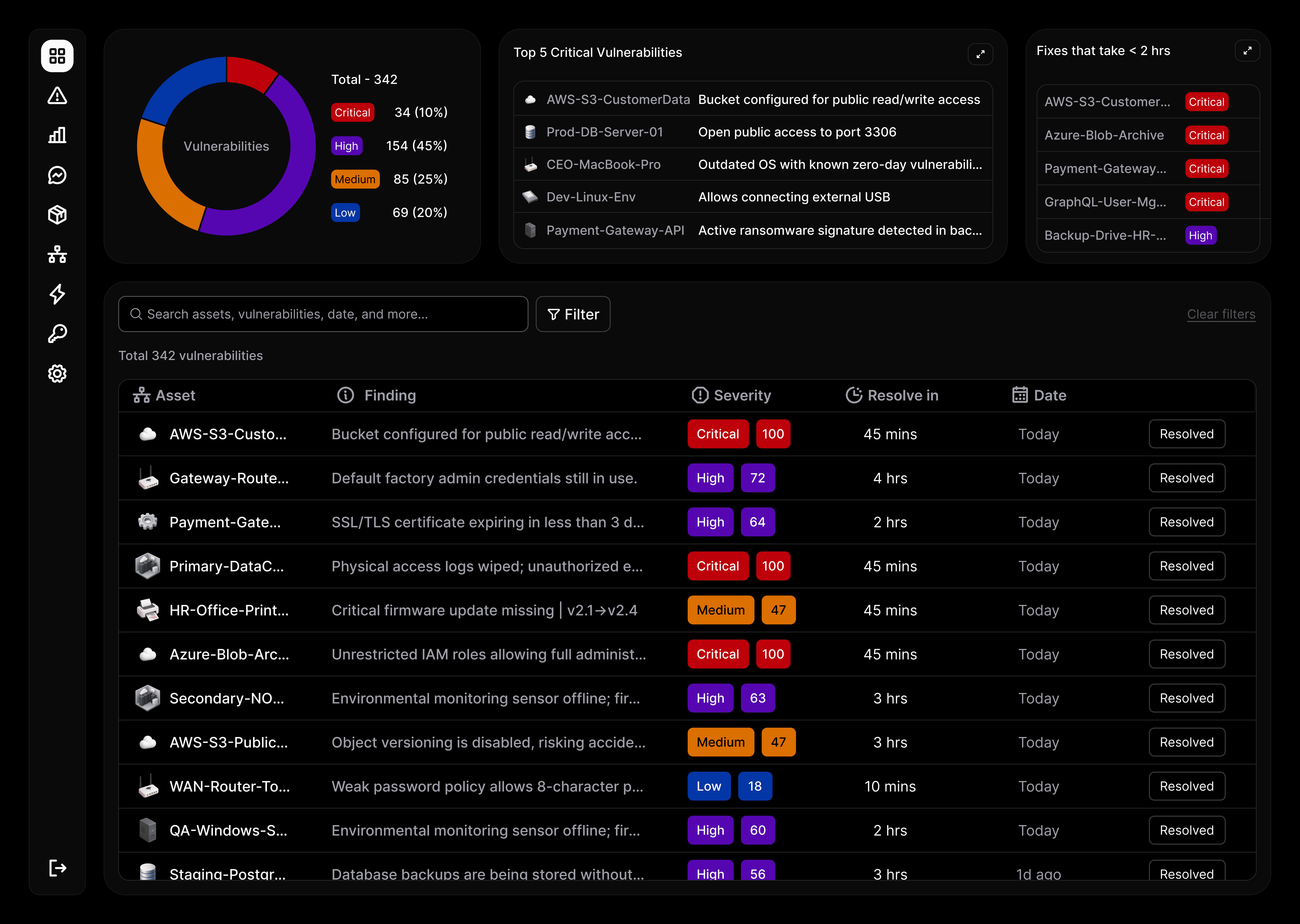
To make the interface feel intuitive, the dashboard is designed keeping a simple, real-world metaphor in mind; treating asset management like containing a forest fire.

This donut chart serves as the bird’s-eye view of the forest fire. Instead of just displaying static numbers (like our total count of 342 active vulnerabilities), it categorizes threats into four distinct scales of severity: Critical, High, Medium, and Low.
To reduce workflow friction, this isn't just a visualization; the widget itself is a filter. Clicking on any slice of the donut instantly narrows down the entire data table below, eliminating the need to fiddle with complex multi-select dropdowns.

If the analyst does nothing else today, they must put out these five active fires. This navigational widget isolates the highest-impact, active security threats and floats them at the top of the dashboard page.
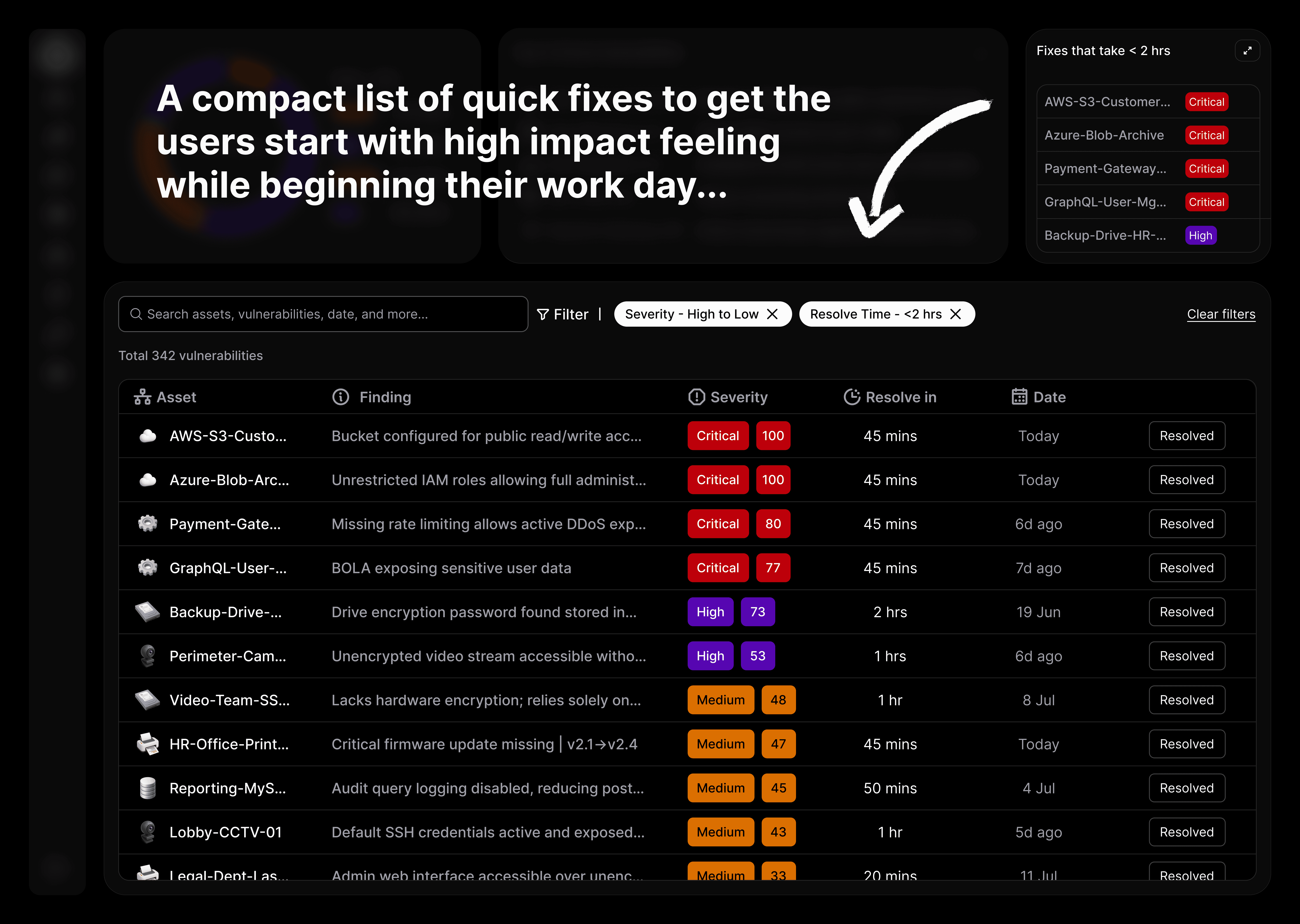
IT analysts have a heavy workload, so satisfying their professional psychology is key. I designed the "Quick Wins" widget to highlight critical or high-severity vulnerabilities that can be fully resolved in less than 2 hours targeting

Once the analyst moves past the high-level widgets, they step into the shoes of an on-the-ground firefighter. The main table acts as the deep work area.
Designed color-coded status tokens to guide scanability. A "Resolved" button embedded directly onto each table row, transformed the table from a static database report into a highly active task manager.
Outcome
By translating intimidating, high-density threat data into intuitive, clickable shortcuts, the design successfully bridges complex backend systems with human behavior. It completely eliminates the initial cognitive load of sorting through backlogs, allowing security teams to pinpoint, prioritize, and isolate critical vulnerabilities in seconds.
